Pomme Blushe


Services
Project development
Profit & loss | Financial study
Buying
Product development | Root to market
Creative
Branding | Packaging & label design | Website | Product photography | Marketing & POS | Social media management | Ecommerce
Pomme Blushe
Project overview
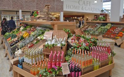
The aim was to develop a unique brand identity and label for Pomme Blushe, an apple-based English aperitif. We were tasked with creating a design that is vibrant and whimsical with modern Art Deco influences as requested by the client. While Pomme Blushe is a drink enjoyed year-round, it will be particularly popular during the Spring and Summer seasons. This is why we designed the branding in such a way that it ensures that it stands out on the shelves during these peak sales periods. We also chose to target females aged 25-35 who enjoy socialising with a refreshing drink.
Services provided
Our team developed the Apple Aperitif and refined the taste profile. The buying department then organised the production and sourcing of the bottles.
We played a key role in crafting a distinctive identity for the exciting new Apple Aperitif Pomme Blushe. Our comprehensive approach included product development, branding, label design, print collateral, website design, and social media support. With a new Instagram, Facebook and TikTok account, Pomme Blush is now able to gain a wider reach and gain popularity and therefore sales.
The outcome
The final design concept embodies a sense of fun, sophistication, and modernity, making Pomme Blushe perfect for any social occasion. This concept uses a clean serif typeface and incorporates an array of garden and apple-related images, arranged in a kaleidoscopic pattern. This symbolises the beauty of nature and immersing yourself in a garden setting while enjoying a refreshing beverage. This arrangement also illustrates the potential for both front and back labels, as well as a tamper seal. We also chose to use highly contrasting hues, ensuring standout visibility and infusing a sense of freshness into the colour scheme.
We also purposely chose a transparent label, allowing for a clear view of the product behind the college elements to add an intriguing visual element to boost the design’s appeal. Additionally, these college elements can be repurposed for marketing initiatives making the brand highly adaptable.
View more of our projects
Farndale Estate
Farndale Estate[wdcl_image_carousel animation_speed="2000ms" slide_count="1" arrow_color="#8DAA8C" arrow_bg="gcid-9dd91acc-233e-4fe7-8add-3c53029d7011" pagi_color="RGBA(255,255,255,0)" _builder_version="4.14.9" _module_preset="default"...
HoundBeam
HoundBeam[wdcl_image_carousel animation_speed="2000ms" slide_count="1" arrow_color="#8DAA8C" arrow_bg="gcid-9dd91acc-233e-4fe7-8add-3c53029d7011" pagi_color="RGBA(255,255,255,0)" _builder_version="4.14.9" _module_preset="default" background_color="RGBA(255,255,255,0)"...
Blue Diamond
Blue Diamond[wdcl_image_carousel animation_speed="2000ms" slide_count="1" arrow_color="#8DAA8C" arrow_bg="gcid-9dd91acc-233e-4fe7-8add-3c53029d7011" pagi_color="RGBA(255,255,255,0)" _builder_version="4.14.9" _module_preset="default"...


